01
Illustration and wordmark
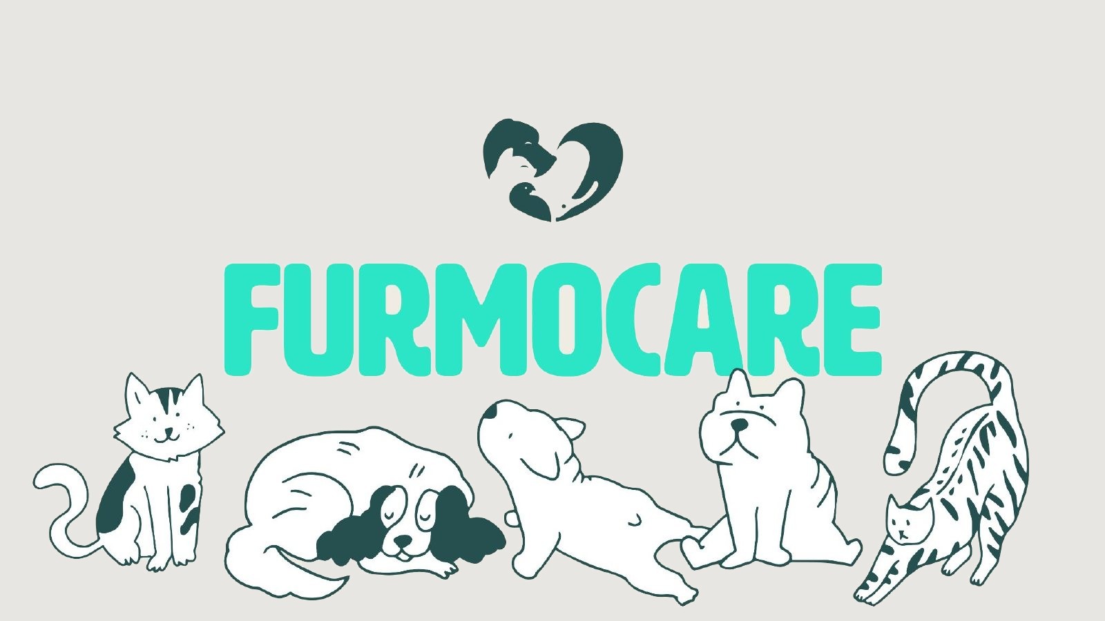
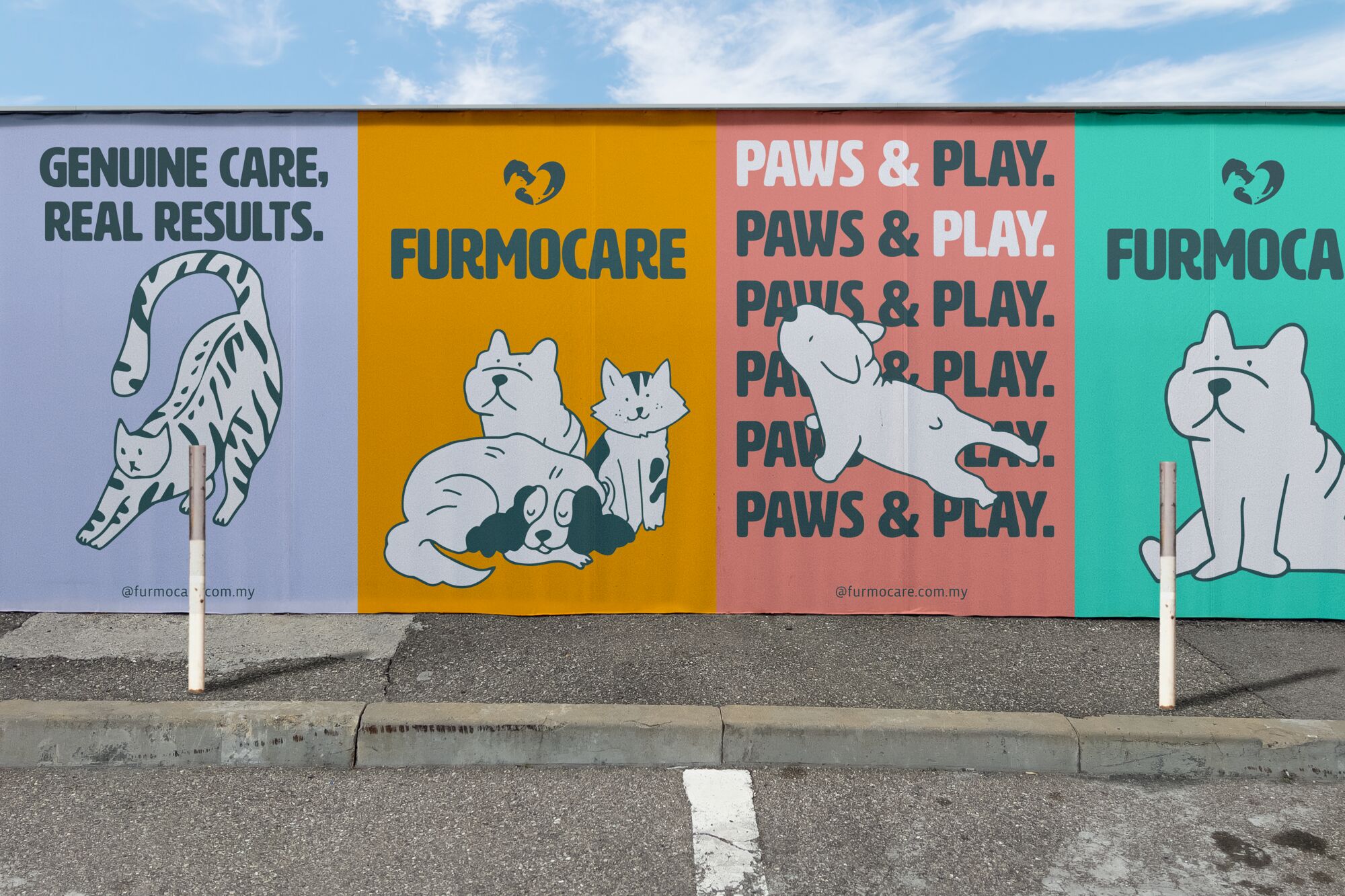
The client's heart icon sits above a new wordmark, with the illustrated cats and dogs doing the talking.
Furmocare is a Malaysian pet care and supplement brand for cats and dogs. Most supplements look like medicine: clinical, cold and hard to tell apart. Starting from the heart icon the client already had, I built the rest of the brand around warmth and clarity: typography, illustration, a colour system for every health need, and packaging that grows with the range.
Pet health products tend to feel clinical and interchangeable. That's hard to love, and hard to remember.
Calming drops, joint support, skin and coat care and food all had to feel like one family, and still be easy to tell apart.
Pet parents buy out of love. The brand had to feel caring and credible at the same time.
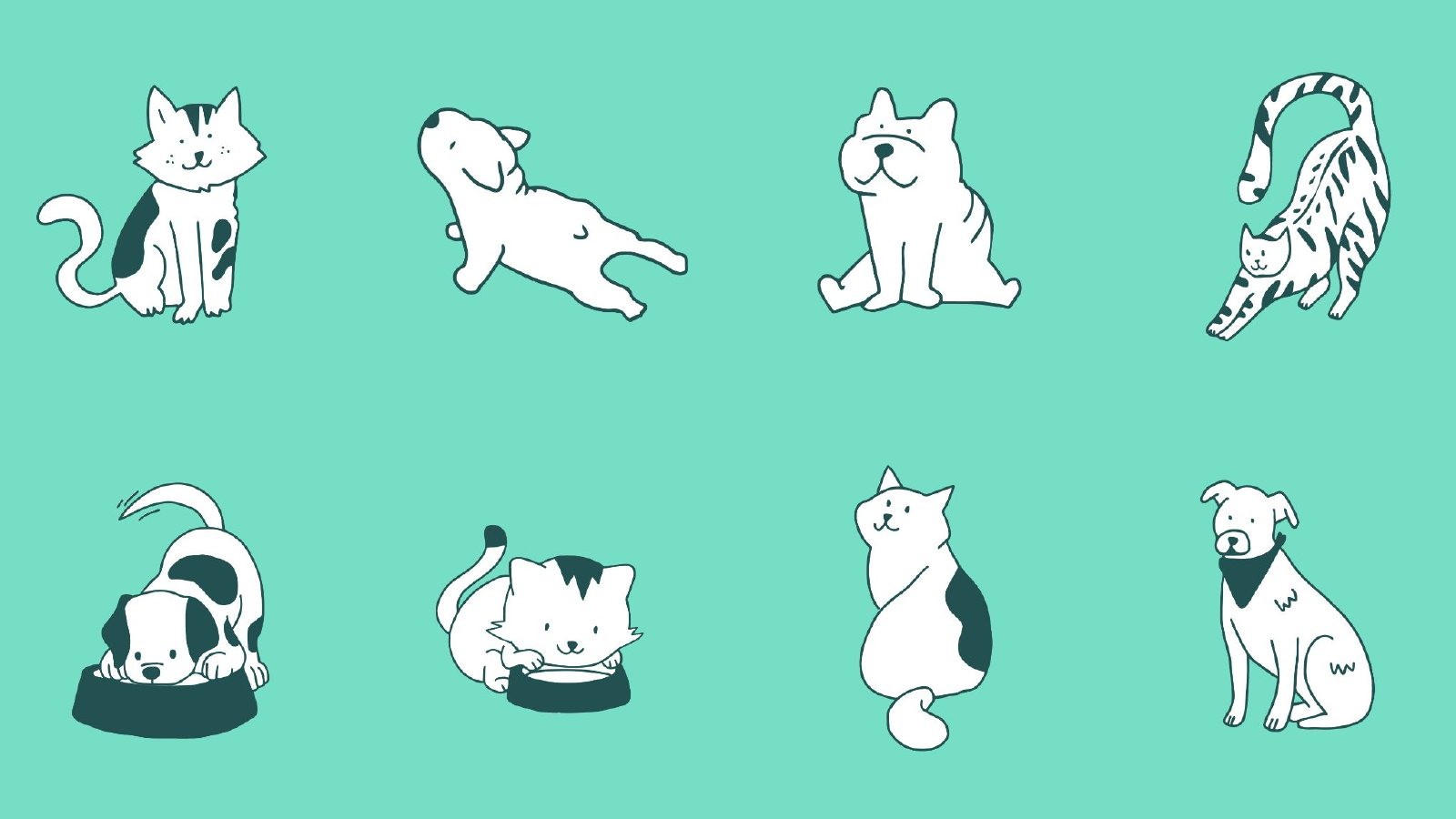
A cast of eight hand-drawn cats and dogs, stretching, napping, eating and sitting, gives the brand its personality, so the rest of the system can stay clear.
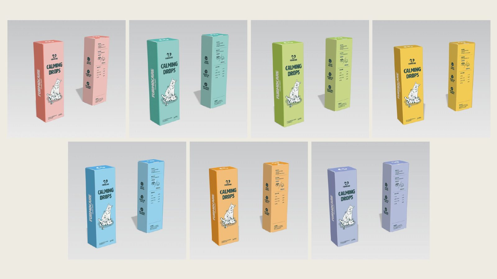
Each health category has its own colour: Internals, Digestion, Vitamins & Minerals, Joint & Mobility, Immune System, Skin & Coat, and Brain & Behaviour. Pet parents can find the right product by colour.
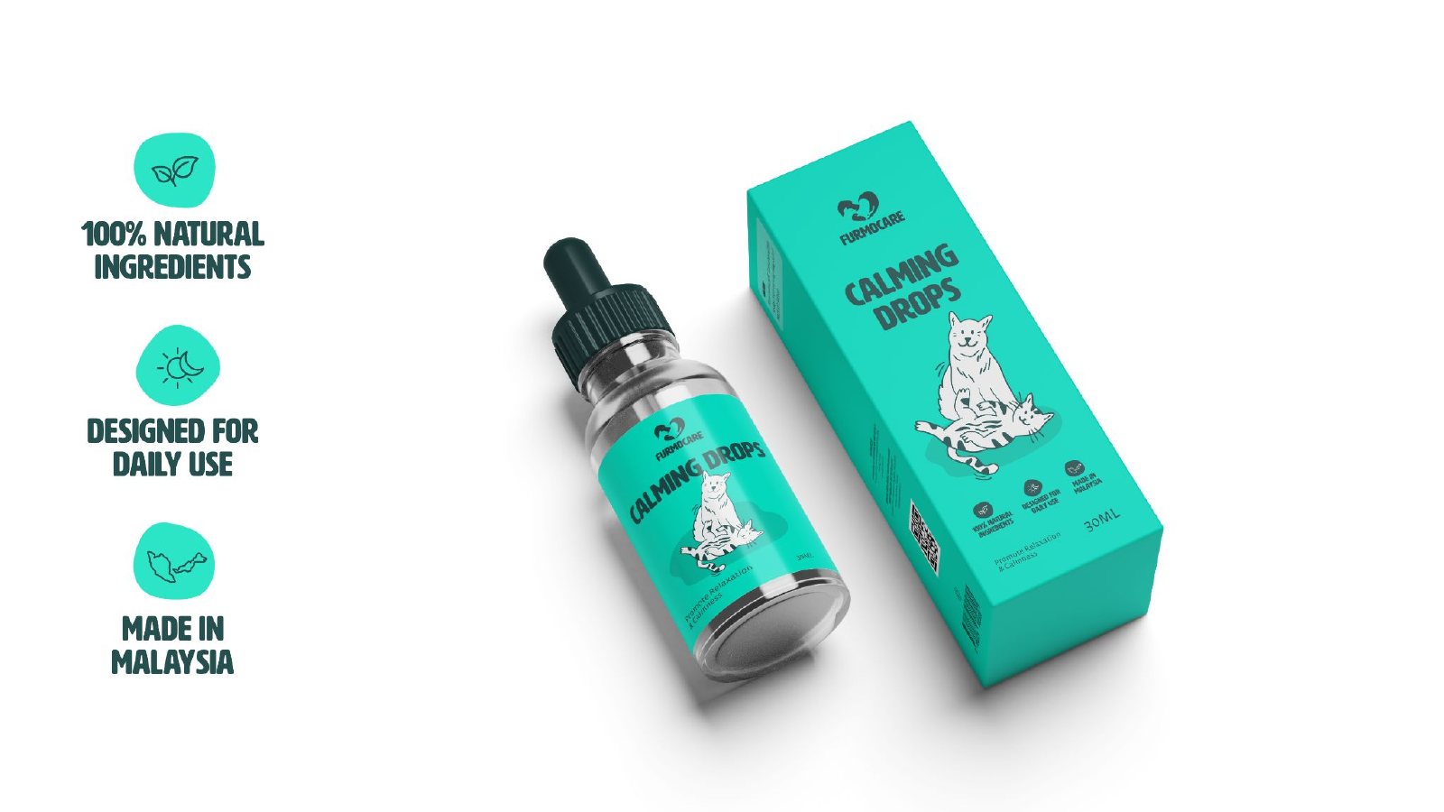
A bold, rounded wordmark and headline style, a soft humanist face for dosage and details, and simple proof points: 100% natural ingredients, designed for daily use, made in Malaysia.
The client's heart icon sits above a new wordmark, with the illustrated cats and dogs doing the talking.
Furmocare planned to launch a lot of products and needed a way to sort them, so the palette had to flex as far as possible. A steady core of Pawfect Pine, Dewdrop Dream and Snuggle Cloud holds the brand together, and playful accents like Purrmaiden Blue, Mango Meow and Purry Peachy add energy. A second set of colours gives each health category its own code. New products slot into a segment straight away and still look like part of the family.
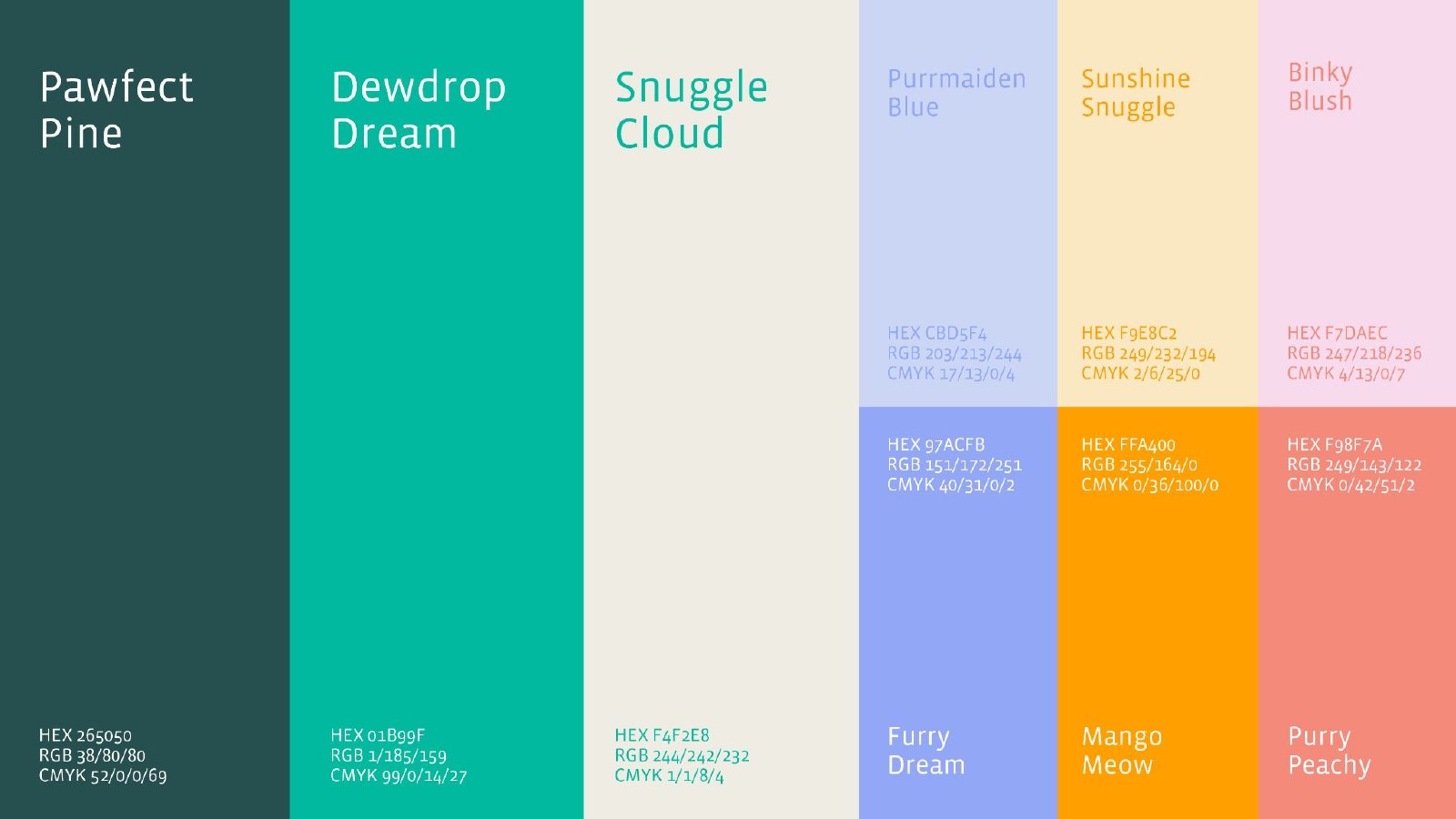
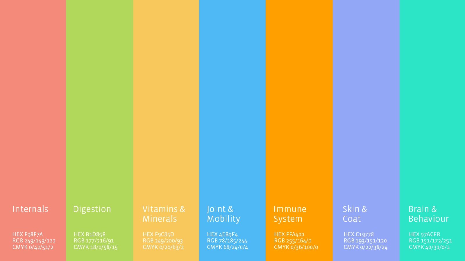
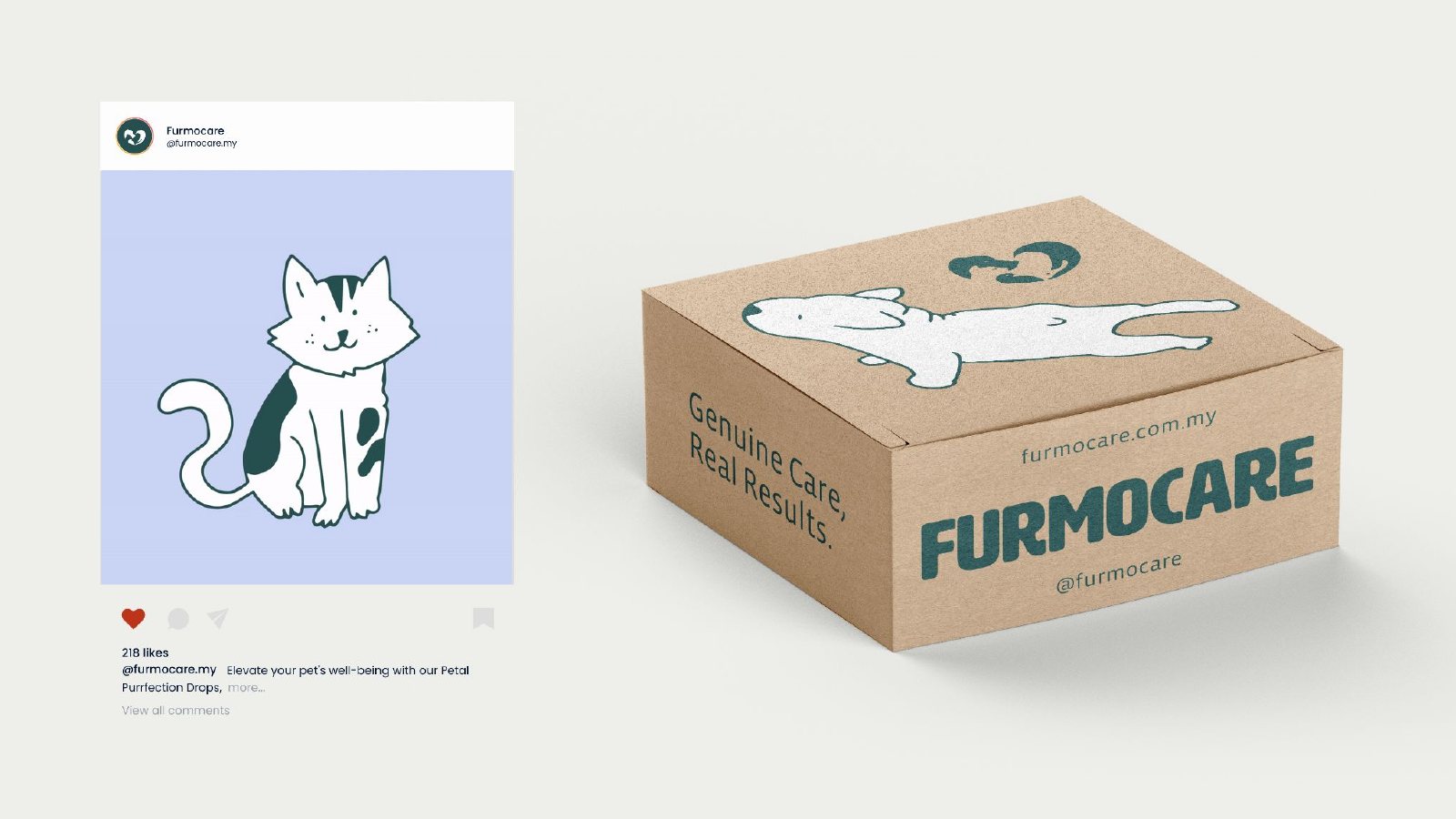
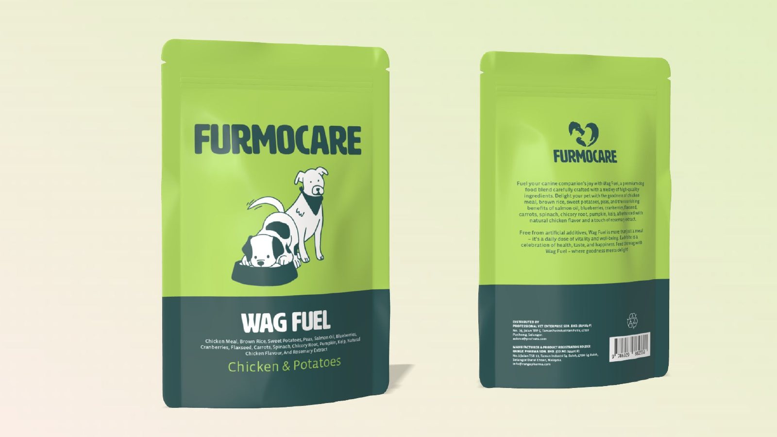
One box layout in seven category colours, so Calming Drops and the rest of the range read as one family. Wag Fuel dog food uses the same illustration and type in a food-first layout.
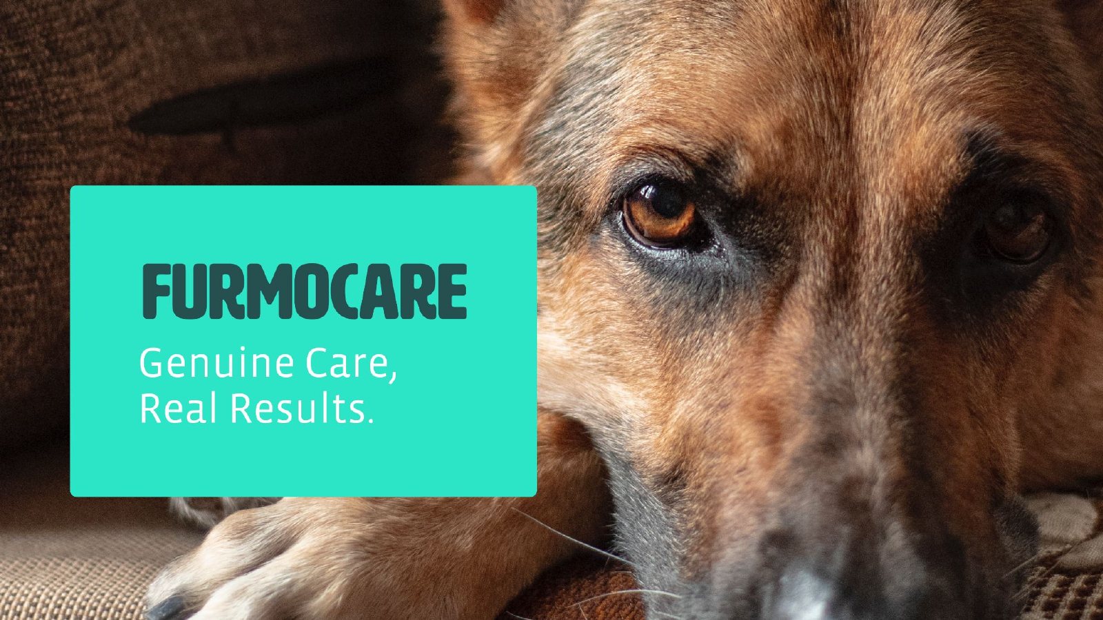
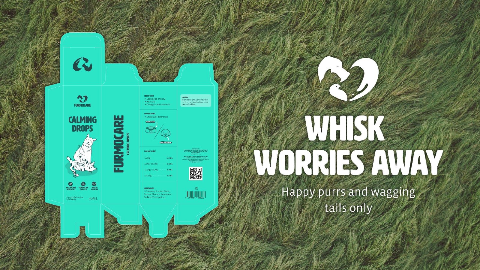
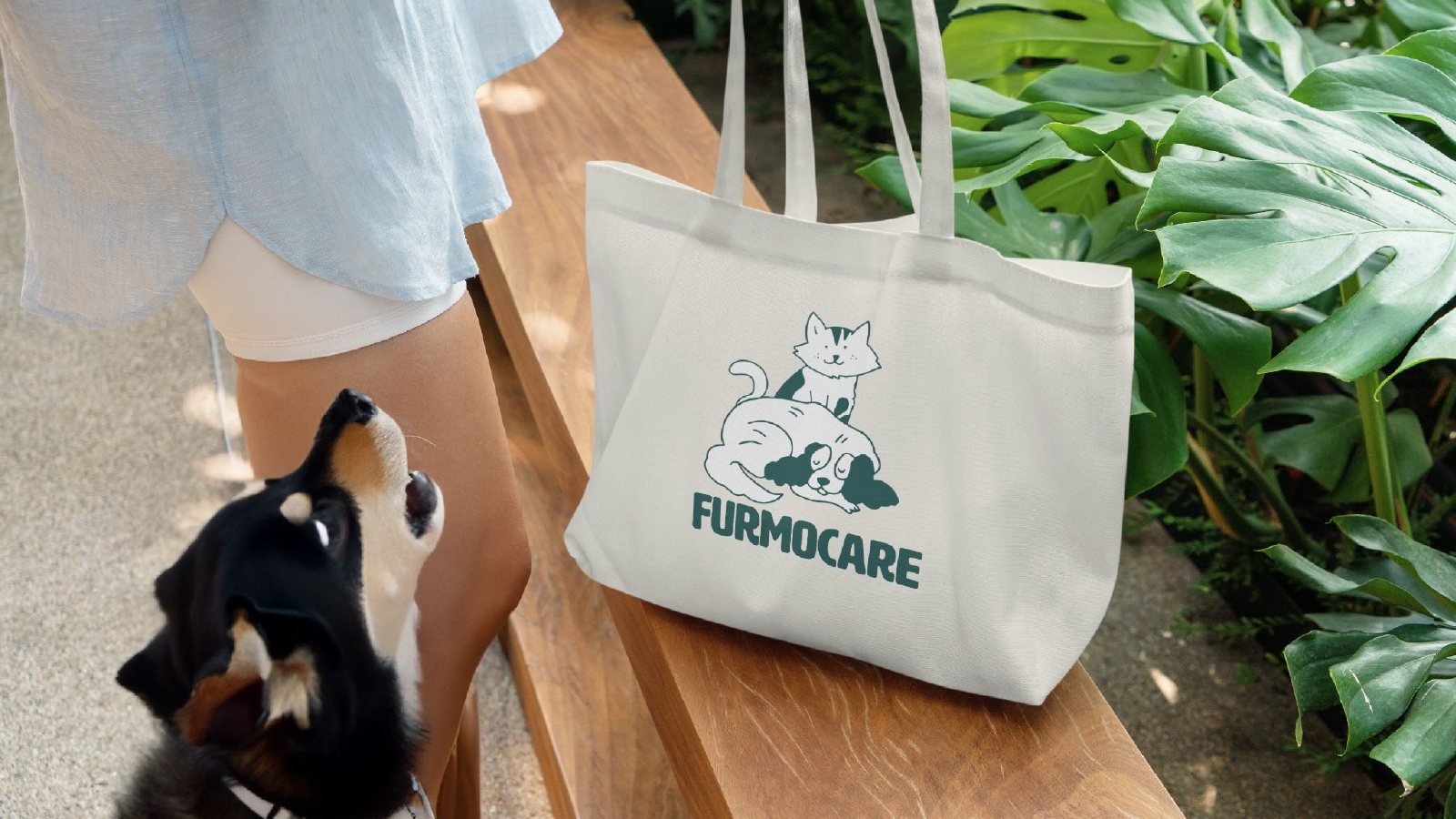
Campaign lines like "Genuine care, real results." and "Whisk worries away" carried the brand onto billboards, social, shipping boxes and totes.
Furmocare adopted the identity and it's live today. The brand's own team has since taken it further, building on the foundations set here.